
Party City Rebrand
Repositions Party City from a cluttered discount retailer to a vibrant, modern celebration brand
Introduces a clean, bold, and playful visual identity centered on joy, accessibility, and sustainability
Aims to reconnect with loyal customers while attracting a younger, style-conscious, eco-conscious audience
Design Category
BRAND AND IDENTITY PACKAGE DESIGN
Lists of Deliverables
Shopping Bag
Gift Card
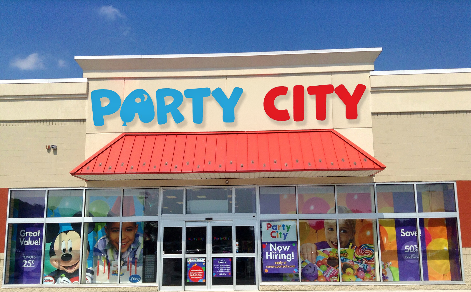
Store Window


Research
Party City was successful because it offered nearly every party supply and costume customers could need or desire, making it a one-stop shop for celebrations.
Their call to action focused on people seeing the company’s commercials and advertisements on TV, encouraging them to visit the store.
The brand’s consumer approach included keeping customers happy, restocking products regularly, and improving customer service.
The store atmosphere was exciting and energetic, making customers feel ready to celebrate as soon as they walked in.
During 2021–2022, COVID-19 changed consumer behavior as events and gatherings were limited.
In 2023, the company filed for bankruptcy with approximately $1.7 billion in debt due to financial struggles.
By the end of 2023, over 800 stores were permanently shut down, severely impacting the company and leading to widespread closures.
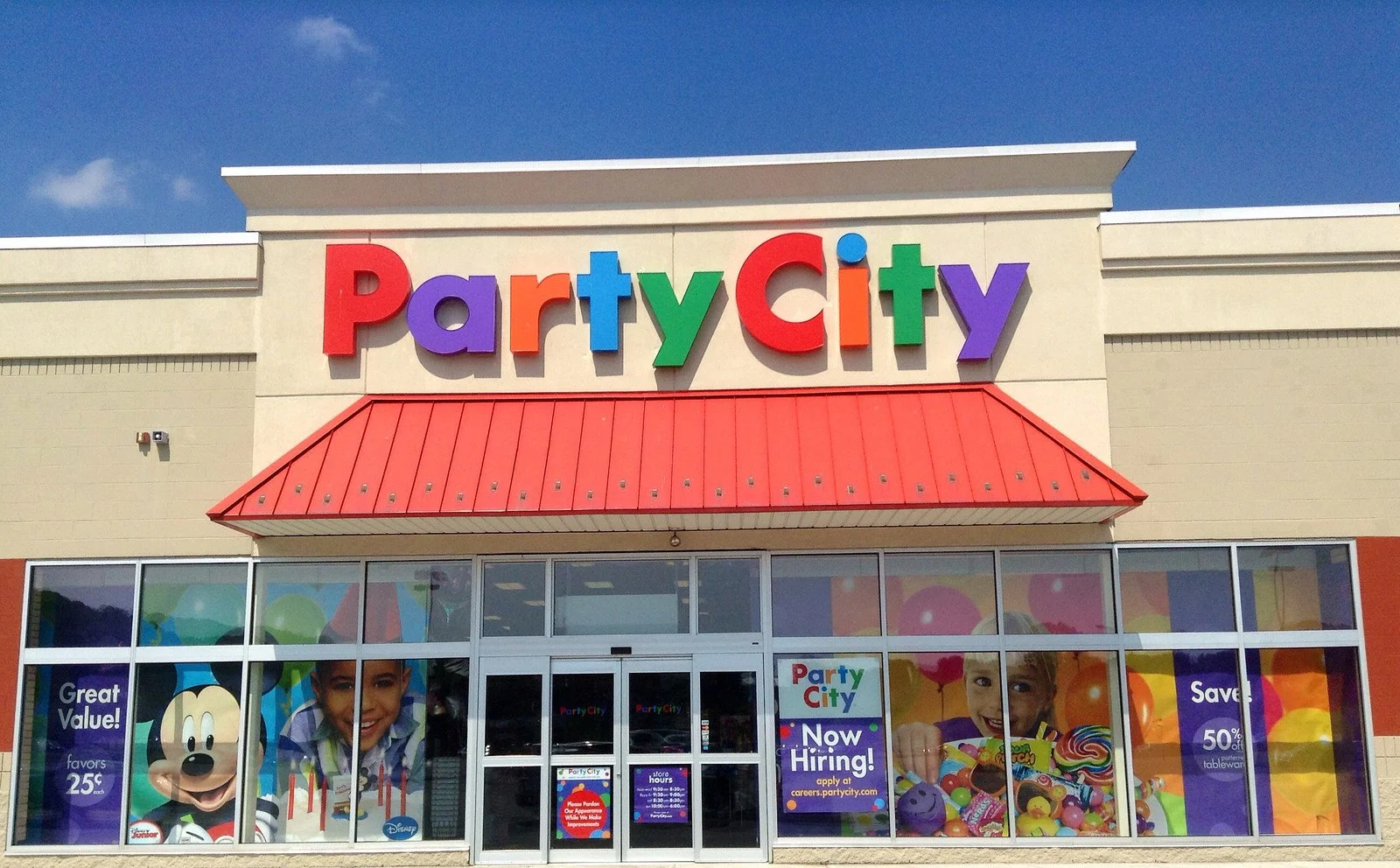
This is the Old Party City Logo
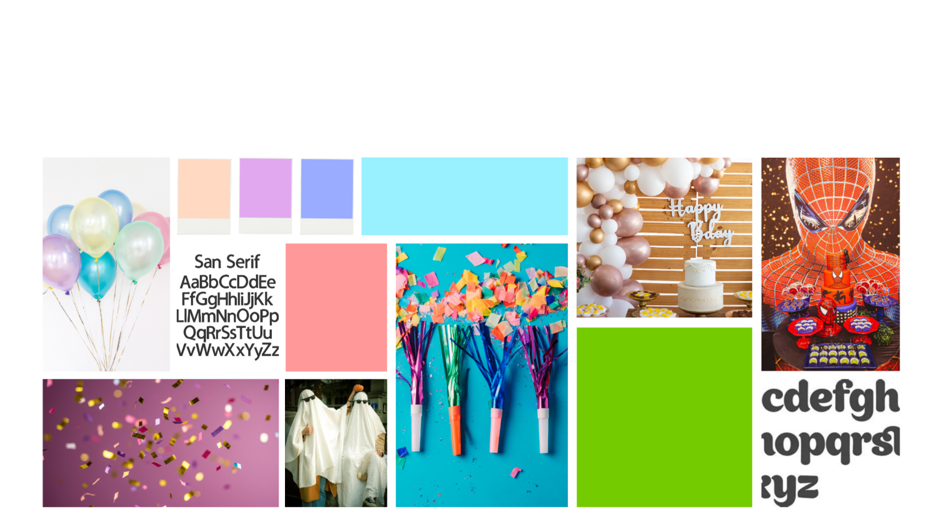
Mood Board
Design Elements

Primary Font:

Secondary Font:
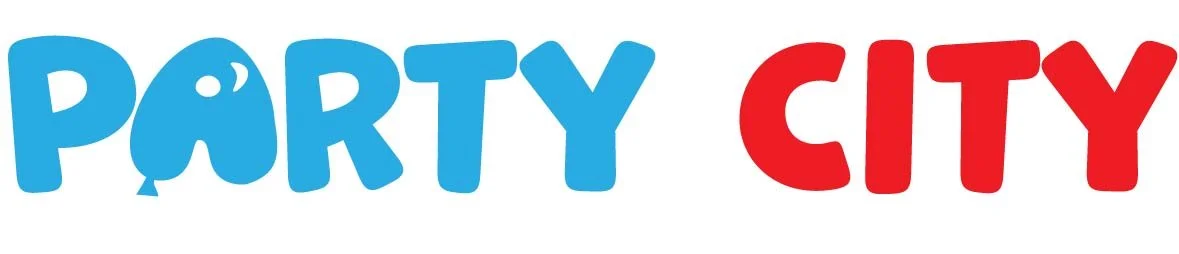
Logo:
Color Palette
#ee1c24
R: 238
G: 28
B: 36
#28abe2
R: 40
G: 171
B: 226
Mockups
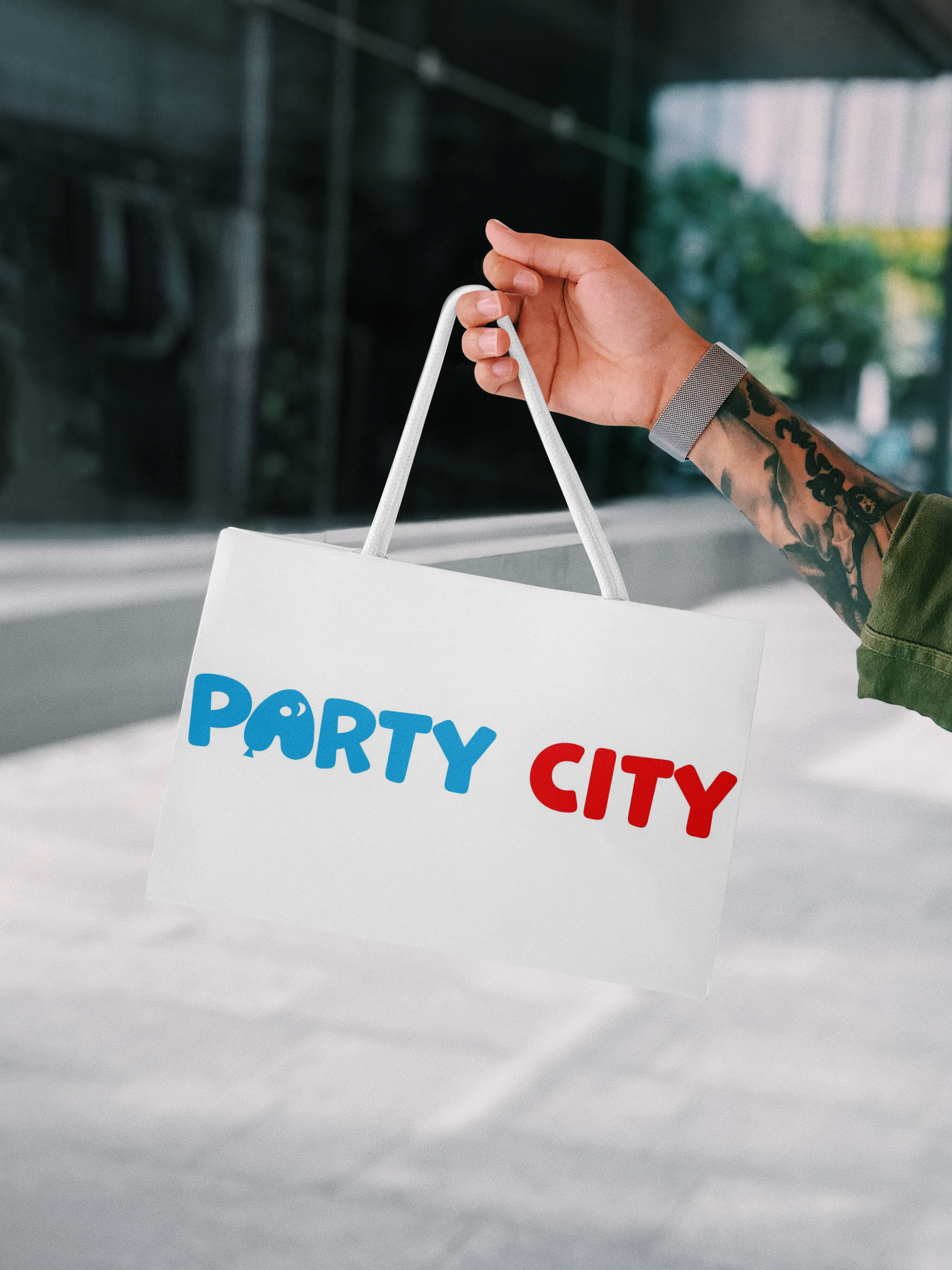
Shopping Bag 10x6.56
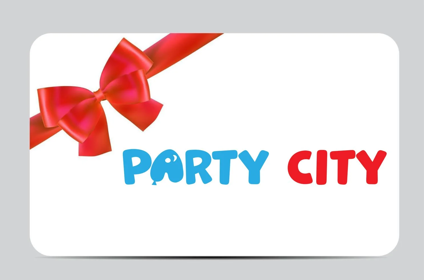
Gift Card 20.63x13.61
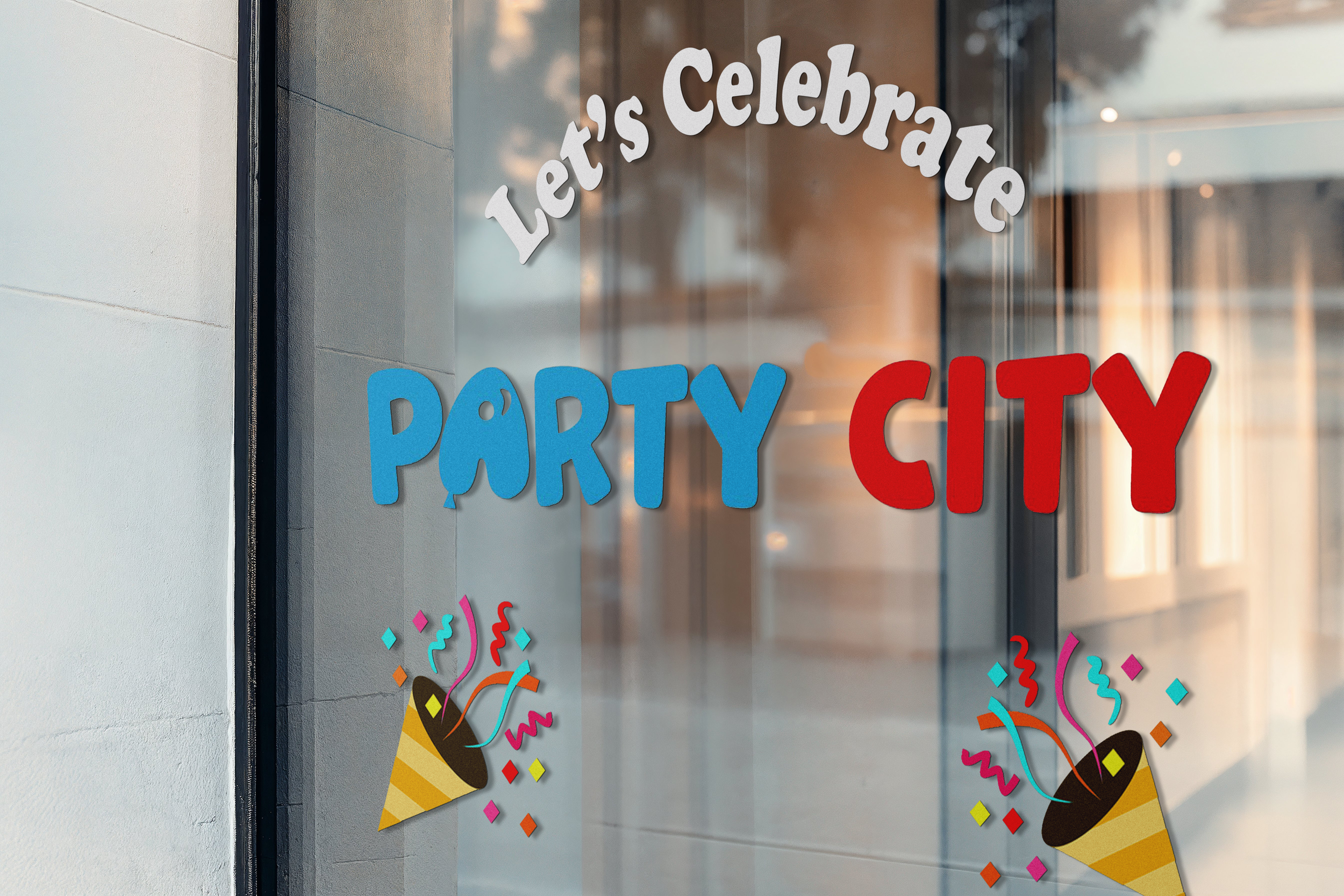
Store Window 15x10